
What did the planet look like in 1900? What will it look like in 2100 — or 2126? Below is an interactive instrument panel that lets you drag a single slider across 226 years and watch four vital signs move: global temperature, atmospheric CO2, sea level, and Arctic sea ice.
Everything up to 2026 is real, measured history — pulled from NASA's GISS temperature record, NOAA's CO2 monitoring going back to ice cores, tide-gauge and satellite sea level data, and NSIDC's satellite record of Arctic ice. Push the slider past today, and you're choosing a future: rapid climate action, our current path, or a fossil-fuel-heavy path, each based on published IPCC projections rather than a guess.
Try dragging to 1958, when continuous CO2 monitoring began. Try 2012, the year Arctic sea ice hit its lowest recorded extent at the time. Then push past 2026 and toggle between the three future paths — the gap between "rapid action" and "fossil-heavy" by 2100 is the whole point.
Sources are listed in the footer of the tool itself. Projections beyond 2100 are rough extrapolations, not formal IPCC modeling, and the world map shows an illustrative warming pattern (based on real polar amplification science) rather than country-by-country data.

OBSERVATORY LOG1900 – 2126
How the planet's vital signs have moved
Drag the slider to travel from 1900 to 2126. Everything up to 2026 is measured record; everything after is a published projection under a chosen emissions path — not a forecast anyone can be certain of.
2026
RECORDED
1900195020002026 · today20752126
Beyond 2026, assume:
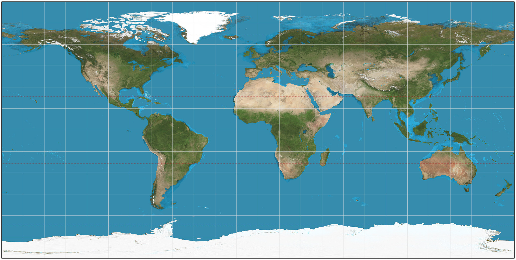
Illustrative warming pattern for the selected year — not per-country data. Shading follows the well-documented pattern of polar amplification (the Arctic warms roughly 3–4× faster than the global average) and slower warming over the tropics and Southern Ocean.
Global temp. vs 1850–1900—
Atmospheric CO&sub2;—
Sea level rise since 1900—
Arctic sea ice (Sept. min.)—